
To understand why this choice is so difficult, we have to look at the “soul” of each design. As someone who has spent years perfecting UI flows and branding for redapk.net, I can tell you that a logo is never just a picture—it’s a promise of what the app does.
Table of Contents
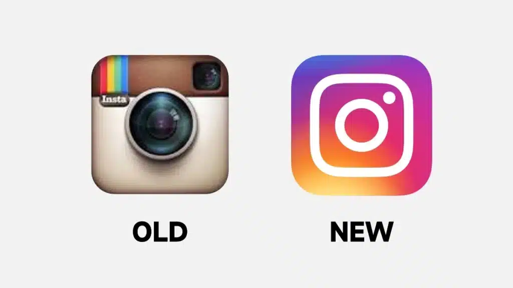
1. The Old Logo: Skeuomorphism and Nostalgia (2010–2016)
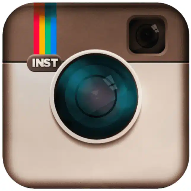
The original Instagram logo was a masterpiece of skeuomorphism—a design style that mimics real-world objects. It featured a brown, leather-textured Polaroid camera with a distinct rainbow stripe and a glass-like lens.
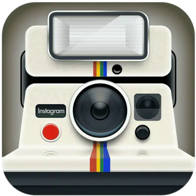
Why People Still Love It:
- Tactile Feel: It felt like you could reach out and touch it.
- Nostalgia: It reminded us of the early days of “filters” and the joy of instant photography.
- Personality: It was unique in a sea of generic digital icons.
For those who miss this era, many users often search for Instagram legacy versions on RedAPK just to see how the interface used to feel before everything went monochrome.
2. The New Logo: Minimalism and The Gradient (2016–Present)
When Instagram swapped the brown camera for a bright pink-to-orange gradient and a simple white outline, the internet “melted down.” Critics called it “murdered at sundown,” but as a designer, I see it as a brilliant move toward scalability.
Why the New Design Works:
- Versatility: The white glyph (outline) works perfectly on everything from a 1-inch smartwatch screen to a 100-inch billboard.
- Energy: The gradient, which was updated in 2022 and 2025 to be even more vibrant, reflects the “living” nature of Reels and Stories.
- Content First: By making the logo abstract, the app shifted focus from the camera to the community.
3. The Designer’s Perspective: Why Change was Mandatory
In my 300+ projects, I’ve had to explain to clients that a logo must evolve with its technology. Instagram is no longer just a “photo filter” app; it is a global entertainment hub for video, shopping, and messaging.
A detailed, 3D Polaroid camera simply doesn’t represent Reels or Threads as effectively as a vibrant, abstract symbol does.
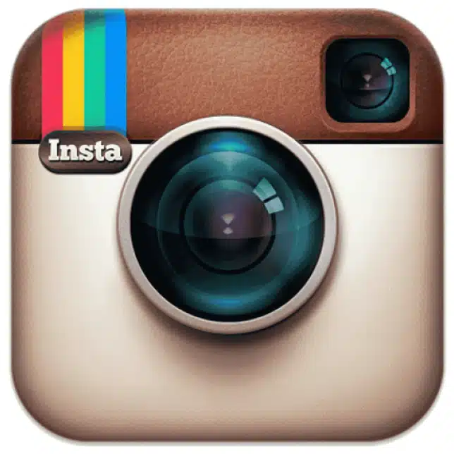
Comparison Table: Old vs. New
| Feature | Old Logo (Retro) | New Logo (Modern) |
| Style | Skeuomorphic (3D) | Minimalist (Flat) |
| Primary Vibe | Nostalgic / Professional | Energetic / Creative |
| Visibility | Harder on small icons | High contrast/Visibility |
| Source | RedAPK Archives | Official Play Store |
4. Why You Might Prefer One Over the Other
Your preference often depends on when you started using the internet.
- Gen Z & Gen Alpha: Tend to prefer the New Logo because it looks like the modern, fast-paced world they grew up in.
- Millennials: Often cling to the Old Logo because it represents the “Golden Age” of the internet—before algorithms and ads took over.
If you are looking for the latest versions of social apps with the newest visual identities, sites like www.redapk.net are excellent for tracking how these logos change from version to version.
Conclusion
So, which one wins? While my designer brain appreciates the simplicity and technical brilliance of the New logo, my heart will always have a soft spot for the texture and warmth of the Old camera.
In 2026, Instagram is all about “humanized visual identity.” Whether you like the old brown camera or the new neon gradient, the goal is the same: connecting people through visuals.
Best regards,
Salman Khan
(Graphic Design & UI/UX Expert | 300+ Projects)
Resource Links:
- Instagram Logo Evolution History
- Download Latest APKs on RedAPK
- Design Trends for 2026
- Official Instagram Brand Resources